Method of the Free-Hand Curve
This is a familiar concept, and is briefly described for drawing frequency curves. In case of a time series a scatter diagram of the given observations is plotted against time on the horizontal axis and a freehand smooth curve is drawn through the plotted points. The curve is so drawn that most of the points concentrate around the curve, however, smoothness should not be scarified in trying to let the points fall exactly on the curve. It is better to draw a straight line through the plotted points instead of a curve, if possible. The curve fitted by this method eliminates the short term and long term oscillations and the irregular movements from the time series, and elevates the general trend. After having drawn such a curve or line, the trend values or the estimated $$Y$$ values, which may be denoted by $$Y$$, can be read from the graph corresponding to each time period.
One of the major disadvantages of this method is that different individuals draw curves or lines that differ in slope and intercept, and hence no two conclusions are identical. However, it is the most simple and quickest method of isolating the trend. This method is generally employed in situations where the scatter diagram of the original data conforms to some well define trends.
Example:
Measure the trend using the method of the freehand curve from the given data of production of wheat in a particular area of the world.
|
Years
|
1981
|
1982
|
1983
|
1984
|
1985
|
1986
|
1987
|
1988
|
1989
|
|
Production Million Metric Tons
|
6.6
|
6.9
|
5.6
|
6.3
|
8.4
|
7.2
|
7.2
|
8.5
|
8.5
|
Solution:
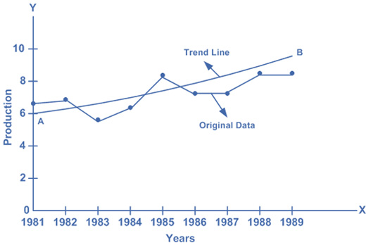
We observe that the graph of the original data does not show any closeness to any type of curve. It looks like it increases very slowly in a straight (linear) manner. Thus we draw a line $$AB$$ as an approximation to the original graph. The line $$AB$$ represents the trend line, and from this we read the trend values for the given years.