Simple Bar Chart
A simple bar chart is used to represent data involving only one variable classified on a spatial, quantitative or temporal basis. In a simple bar chart, we make bars of equal width but variable length, i.e. the magnitude of a quantity is represented by the height or length of the bars. The following steps are used to draw a simple bar diagram:
-
Draw two perpendicular lines, one horizontally and the other vertically, at an appropriate place on the paper.
-
Take the basis of classification along the horizontal line ($$X – $$ axis) and the observed variable along the vertical line ($$Y – $$ axis), or vice versa.
-
Mark signs of equal breadth for each class and leave equal or not less than half a breadth between two classes.
-
Finally mark the values of the given variable to prepare required bars.
Example:
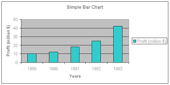
Draw simple bar diagram to represent the profits of a bank for $$5$$ years.
|
Years
|
1989
|
1990
|
1991
|
1992
|
1993
|
|
Profits (million $$)
|
10
|
12
|
18
|
25
|
42
|
A simple bar chart showing the profits of a bank for 5 years:
Simple Bar Chart